DESIGN
PRINT PROGRESS
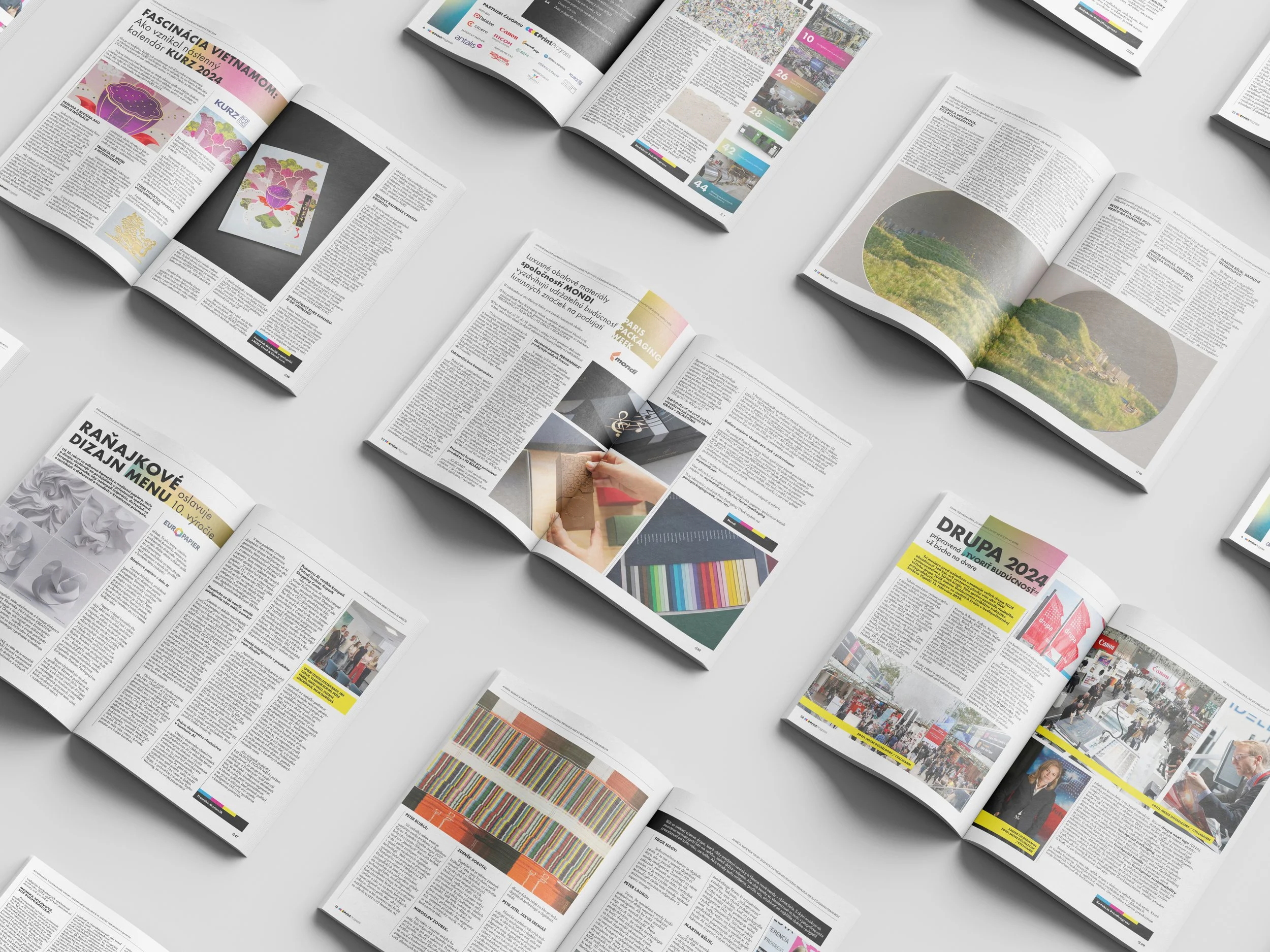
Visual concept and multi-year execution for a magazine covering printing and polygraphy trends and industry topics. Scope of work covers layouts, typography, and editorial graphics.
The magazine is partnered with Konica Minolta, Canon, Koenig & Bauer, Ricoh, IGEPA group, LEONHARD KURZ Stiftung & Co. KG, and others.
Client
VELDAN
-
The magazine originally came without a clear visual identity, which opened the door to building a flexible and modular system from the ground up.
The idea was to rely on minimal elements to give the content and visuals from partners room to stand out. One of the challenges was working with extremely text-heavy layouts, where every bit of space had to be carefully organized to maintain clarity and readability.
DOMOV STROMOV
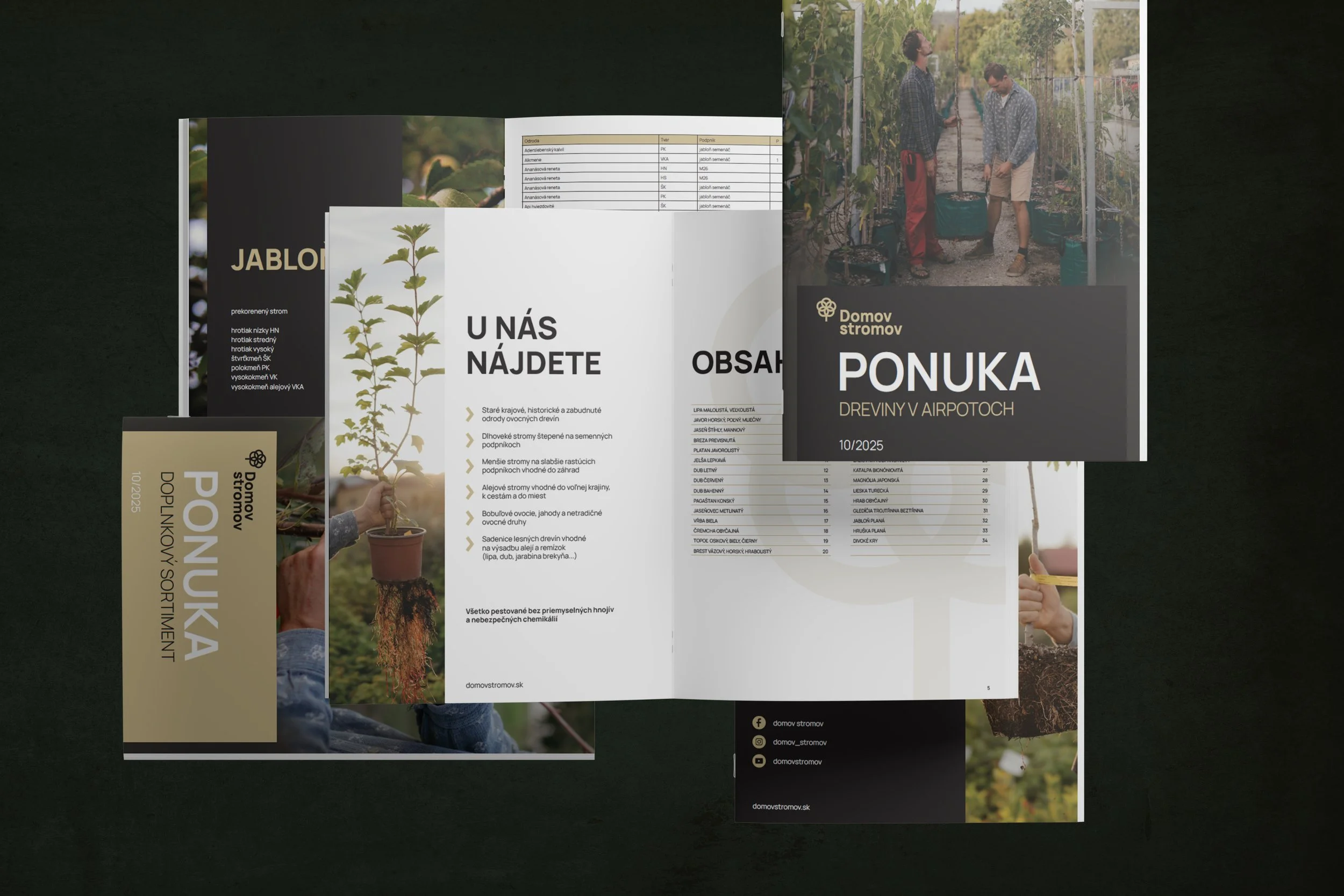
Visual design and layout of product catalogues for a fruit and ornamental tree supplier. The work centered on creating a modern, easy-to-read format for organizing dense product and pricing information.
Client
Domov stromov
-
The catalogue was designed for B2B market, where efficiency and clarity of information were the highest priority. Earthy tones were chosen to complement the product.
Working with a tight deadline, the process prioritized simplicity and reliance on proven trends for the best outcome. No unnecessary embellishments added to overcomplicate the visuals and prolong the time needed for finalization.
LMS
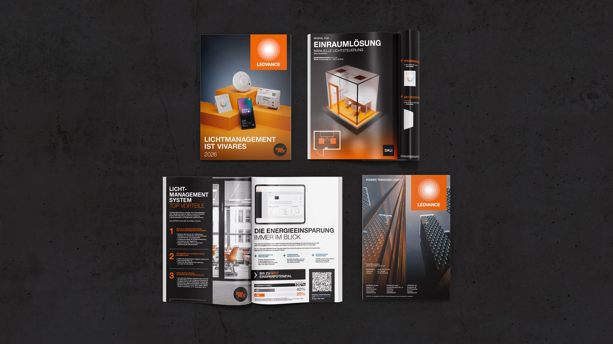
Brochure design for a light management systems publication created as part of an in-house design role. Scope of work covered information structure, layout development, and custom 3D visuals, with emphasis on marketing and target group alignment. Content and copy were developed in collaboration with internal teams and departments, implemented under corporate identity guidelines.
Client
LEDVANCE GmbH
-
This brochure focuses on light management systems and was conceived as both an introductory guide and a practical training tool. The project required first building a solid understanding of the subject matter, translating technical concepts into content that would be accessible, structured, and useful for non-specialist audiences.
A key part of the process was defining the brochure’s narrative flow (from general introduction, through core principles, to technical data and supporting information). The goal was to create a logical learning material where each section naturally builds on the previous one, ensuring clarity without oversimplifying the topic. At the same time, the brochure needed to retain its role as a communication and marketing asset.
All visual elements were developed as part of the project, including layouts, custom infographics, iconography, and supplementary 3D renders. The design balances informational density with readability while adhering to established brand guidelines.
The brochure was created in close collaboration with internal colleagues who actively use the material in their day-to-day work, ensuring that both the content structure and visual language supported real-world application.
SPECTRUM
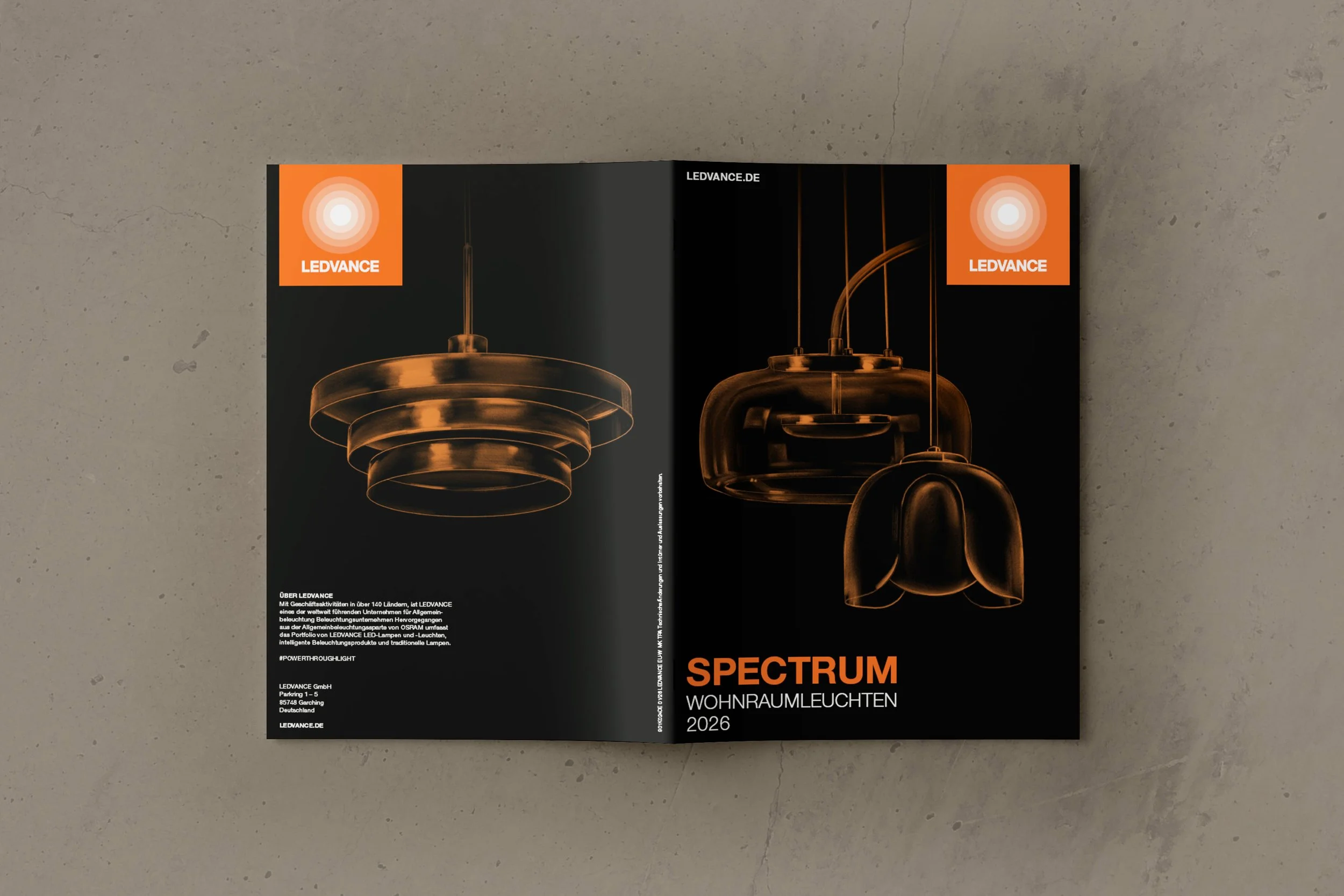
Final design refinement and cover development for a brochure project. The work focused on polishing the layout and creating a custom illustrated cover, introducing a hand-drawn element to complement the product portfolio.
Client
LEDVANCE GmbH
-
This brochure presented a B2B portfolio of decorative luminaires, with the primary task centered on developing the cover concept. The challenge was to maintain a professional, business-oriented tone while visually communicating the decorative, interior-focused nature of the products.
The final direction uses a hand-drawn illustration of the featured luminaires, rendered in a minimal orange line on a black background. This approach preserved the clarity and restraint expected in B2B materials, while subtly differentiating the brochure from typical industrial or purely technical presentations.
Multiple compositional variations were explored before selecting the final layout. The result balances technical accuracy with a more intriguing, atmospheric visual identity.